What's new
Find out what's happening in the world of Sanoma Learning's Design System.
SL Design System Update
February - March 2026
Here's an update on what we've been working on recently:
Component Status Updates
- Callout has been promoted from
drafttopreview.
New Features
- Angular includes a new
DateFieldDirectivefor<sl-date-field>and aMessageDialogServicefor programmatically opening and managing message dialogs. - Button Bar exposes new
:state(icon-only)and:state(empty)pseudo-classes for custom styling. - Callout has improved color contrast when using links in the body and updated
variantvalues to match other components. - Data Source has a new
setData()method onArrayListDataSourcefor updating data without losing state (e.g. selection). - Date Field uses separate
spinbuttoninputs for each date part for better accessibility, supports keyboard entry for any locale, and adds a newrequireConfirmationprop for the calendar popover. - Menu has improved keyboard navigation and focus management, including proper submenu Escape behavior, initial focus on open, and closing menus when focus leaves.
- Time Field has improved
minandmaxconstraint handling, disabling out-of-range minutes in the picker.
Bug Fixes & Improvements
We have been working on a lot of bug fixes, the details can be found on our release notes page. The following components have one or more issues resolved:
breadcrumbsbuttoncalendarcomboboxdate-fieldformgridiconmenusearch-fieldselecttabstime-fieldtool-bartooltiptree
Theme Updates
- All themes have been updated with new tokens (
icon.2xs,color.background.highlight,elevation.surface.raised.primary), improved form input interactive backgrounds for better state contrast, new caret icons aligned with the Font Awesome 7 strategy, and link color overrides inglobal.css. - Magister has new values for
color.palette.orangeandcolor.palette.grey, with adjusted tokens that depend on them. Additional color token adjustments for grey backgrounds and neutral foreground. - Sanoma Learning has changed
color-foreground-disabledandbackground-foreground-accent-grey-subtlesttokens.
Documentation Updates
- Callout - New documentation added with usage guidelines, accessibility information and code examples.
SL Design System Update
January 2026
Here’s an update on what we’ve been working on recently:
New Components and Features
Calendar - New version of the component with improved styling and accessibility.
Shared - New utilities added to the shared package for potential reuse across components:
dateListConverter- Utility for date list conversionsNewFocusGroupController- Utility for focus management
Both utilities are currently used in the Calendar component and have been added to
@sl-design-system/sharedfor potential reuse in other packages in the future.
Other Improvements
We have been working on a lot of bug fixes, the details can be found on our release notes page. The following components have one or more issues resolved:
Documentation Updates
- Number Field - API documentation has been improved.
SL Design System Update
August - December 2025
Here's an update on what we've been working on recently:
New Components
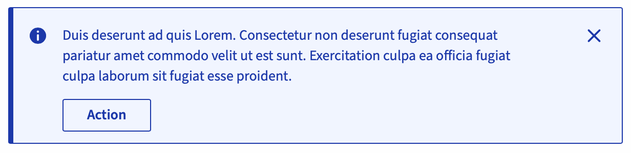
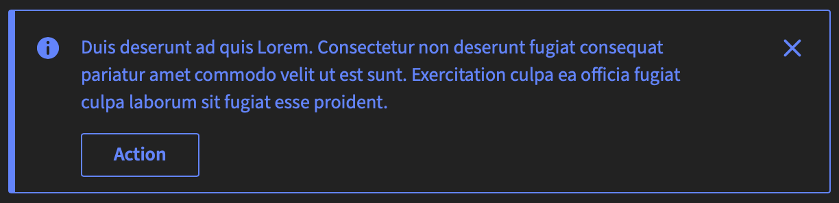
- Callout is a new component, visually similar to the inline-message but with a different purpose: it can be used to provide additional, non-interrupting information and may include actions (e.g. buttons). Unlike inline-message, it's not meant to be shown/hidden dynamically in response to user actions.
- Time Field component is now available for time input with a built-in time picker dialog.
- Virtual List is a new utility package that provides a virtual scrolling solution based on
@tanstack/virtual-core.
Component Status Updates
- Menu has been promoted from draft to preview.
- Number Field has been promoted from draft to preview.
- Tag has been promoted from draft to preview.
- Tree has been promoted from draft to preview and now supports sorting.
Major Component Updates
- Angular now requires Angular 19.0 or higher (tested with Angular 21.0) and TypeScript 5.9.0 or higher. Support for Angular 18 has been removed. The package also includes new bindings for
<sl-time-field>,<sl-combobox>, and<sl-number-field>. - Accordion has a new
iconTypeproperty that allows you to use a chevron icon instead of plus/minus, and now uses contextual tokens for styling. - Avatar has new
color,emphasisandshapeproperties for easier customization (similar to<sl-badge>). - Badge can now have a label on
smbadges; this will be shown behind the dot. - Breadcrumbs has a new
hideHomeLabelproperty to allow hiding the "Home" label text in the first home breadcrumb. - Button now supports
aria-disabled="true"to disable a button while keeping it focusable (useful for tooltips). - Button Bar has new
fillandvariantproperties that will apply to all buttons inside the button bar. - Form now supports more than 1 form control per field.
- Icon now supports Font Awesome 7.1 and scales with the text size when no explicit size is set.
- Panel has improved
densityproperty values - usedefaultandrelaxedgoing forward. Theplainandcomfortablevalues are deprecated, they will be kept for backward compatibility for now but removed in the future. - Search Field now debounces the
sl-searchevent while typing with a default delay of 300ms. - Select now automatically adjusts its width based on the largest option available.
- Tabs has updated styling to align with Figma design (increased width and border radius of the indicator).
- Tool Bar has major improvements including a new
containedproperty to enable contained mode, keyboard navigation support for arrow keys when toolbar is focused, and aninvertedproperty for the divider component. The overall styling has been improved and overflow behavior issues have been fixed. Theno-borderproperty has been removed; the border now only shows incontainedvariant (except wheninverted). When updating to this version of the tool-bar while also using a panel, make sure to update the panel to version v0.3.1 or later. - Tooltip now supports passing a config object to the Lit directive and has an
ariaRelationoption to usearia-describedbyoraria-labelledby.
Theme Updates & Breaking Changes
All theme packages have a major version bump after the refactoring of Figma tokens. Legacy tokens have been moved to separate -deprecated.css files. If you have components that are not updated to use the new tokens, include light-deprecated.css until all components are updated. See the themes README for details. The Clickedu theme has an updated color palette with new brand colors.
Bug Fixes & Improvements
We've been working on numerous bug fixes and improvements. The following components have one or more issues resolved:
accordionbuttoncheckboxcomboboxdata-sourcedate-fielddialogformgridiconinline-messagelistboxmenumessage-dialognumber-fieldpanelpopoverradio-groupselectskeletontabstagtext-areatime-fieldtool-bartooltiptree
Developer Tools
- ESLint Plugin - New
@sl-design-system/eslint-plugin-sldspackage provides an ESLint plugin for the SL Design System. This plugin includes a rule for ensuring any<sl-button>you use has an accessible name. There are 2 more rules that deal withhtmltagged templates. The@sl-design-system/eslint-configpackage has been updated to include the new plugin.
Documentation Updates
We've been working on improving and expanding our documentation. The following components received new or updated documentation:
- Time Field - New documentation added with usage guidelines and examples.
- Button Bar - Documentation has been updated with improved examples and usage guidelines.
- Paginator - New documentation added including examples with data sources.
- Panel - New documentation added with usage, accessibility, and examples.
- Tree - Documentation improvements with better examples and API descriptions.
- Angular Wrappers - Added Storybook documentation for Angular wrappers and directives, making it easier to use the design system in Angular applications.
SL Design System Update
June & July 2025
Here’s an update on what we’ve been working on recently:
Component Updates
- Card is refactored completely in terms of design and options, and partly in terms of html-slots. The way the image is handled is improved so a grid with multiple cards will look more consistent, also helped by the
subgridoption. Because the changes are so big there are some breaking changes, you can find more detail in the changelog of the card component. - Angular has support added for the
DialogService. - Paginator has a new
itemLabelproperty, if you want to count 'students' on the pages instead of 'items' for example.
Other Improvements
We have been working on a lot of bug fixes, the details can be found on our release notes page. The following components have one or more issues resolved:
SL Design System Update
April & May 2025
Here’s an update on what we’ve been working on recently:
Component Updates
- Inline Message: Accessibility improvements are underway (not released yet). Please note: this includes a breaking change – we’ve removed the
actionslot from the inline-message component for accessibility reasons. - Number Field: New documentation has been added.
- Panel: Added density, divider and fill properties
Figma Toolkit Testing
We’ve kicked off testing of our SLDS Figma Toolkit with a small group of designers. Thanks to everyone who signed up! The first batch includes:
- Button
- Checkbox
- Radio Group
- Search Field
- Textarea
- Textfield
A dedicated Slack channel with a feedback system has helped us catch and fix some early issues quickly. A new batch of components will be ready for testing soon.
If you’re interested in joining the test group, feel free to reach out!
Theming
The new variable-based theming setup in Figma is looking solid. Testers were able to apply product themes manually with little trouble. We’re also working on a small helper plugin to simplify the process – more on that soon!
Datagrid Improvements
We're continuing to enhance the datagrid component with:
- Contextual tokens replacing old hardcoded colors and sizes
- Updated design for bulk actions
- UX improvements to in-grid filtering and sortable columns
- Refactored list data sources for better grouping support
- New filter patterns for inside/outside the datagrid
- Example data tailored for the education domain
Work on this is ongoing.
Other Improvements
- Progress Bar: Now supports more color options
- Icons: Now scalable
- Bugfixes: Minor cosmetic fixes for Tabs, Radio Group, and Select
SL Design System Update
January 2025
Below are the updates we made last month. Everything will be available after the release.
New Components
Improvements & Maintenance
- Make it possible to use paginator component with FetchDataSource
- Added pill-shaped buttons and implemented new contextual tokens in the button component
- Implemented new contextual tokens in the badge component
Solved Accessibility Issues
Accessibility Audit, new components and further updates
December 2024
Accessibility Audit
Accessibility is a core focus for us, and we recently conducted an accessibility audit with an external agency to evaluate all our components. We're pleased to report that only a few accessibility issues were identified during the audit. You can view the complete audit overview here. Our goal is to resolve all identified issues by January 2025.
Timeline New Components
Last period, we did a survey where all products using the SL Design System participated to figure out which components should have the highest priority. In the survey, we showed all requested components and asked about their UX impact, how high they are on the roadmap, and what the requirements are. We used the 'RICE' framework to calculate the priority for each request. Turns out, the Number Field, Tree View, Date Picker, and Time Picker are the big winners.
Here you can find the timeline for the design and development of the new components.
Contextual Tokens and Unified Figma Library
The past period, the team has been working hard on contextual tokens. Right now, the SL Design System is using component-specific tokens. By making our tokens contextual instead of component-specific, we’re improving UI consistency across all products.
We’re currently refactoring our components in code to use the new contextual token setup. At the same time, there are some big changes coming in Figma. Right now, every product has its own Figma library with SL Design System components. The goal is to have a single Figma library with one theme that works for all products. Designers will be able to switch between themes directly in this library using Figma Variables.
In the end, this will make the SL Design System team more efficient—less maintenance and more time to focus on new components, patterns, and enhancements. For products, it means more consistent UI design overall.
New Components
Solved Bug Reports
- Rendering the correct column widths when the data grid contains only a few elements
- DATA-SOURCE is missing a declaration file
- Numeric sort behavior in Grid
- Custom sort function in Grid
- Improve performance of large option sets in Grid
Solved Figma Issues
Accessibility Improvements
New Components, Bug fixes, and enhancements
September 2024
Update in Figma
To simplify things, we’ve created a new Formfield component that includes a label, description, validation message, and a slot for the form control itself. This makes it easier for the Design System team to manage everything, while you only need to use one component for all your form controls!
- Older Components: The old form controls (Label, Hint/Helper, Checkbox, Radio Button, Switch, Text Input, Text Area) are now marked as "[DEPRECATED]" and hidden from the library. These should no longer be used in new designs.
- New Components: We’ve introduced new versions of these form controls with improved functionality, labeled with "-NEW" at the end for easy identification.
- Formfield Component: We’ve added a new Formfield component that wraps the updated controls for more consistency. This should now be your go-to component for forms. You can find these updates in the Formfield folder in the assets panel.
New components and status changes
Solved Bug reports
Enhancements
New Components and Key Bugfixes Rolled Out, Including Tool-Bar, Checkbox Group, and Enhanced Styling
July 2024
New components and status changes
Bug fixes
- Checkbox group bugfix for initial checked state
- Form field custom label styling fix
- Various message dialog fixes
- Fix avatar line-height bug
- Fix inline size behavior of dialog
Enhancements
Enhancements and Insights: New Components, Bug Fixes, Styling, and Workshops
June 2024
New components
Bug fixes in several components
Styling updates in
- dialog
- warning color palettes of Sanoma Learning and Editorial suite (this change impacts the styling of multiple components)
Data Grid Workshop
We recently conducted a workshop with all UX designers across our products to define the requirements for our data grid. It marked our first large-scale collaboration on a common component, which was a great experience. Together, we identified the core functionalities of our data grid. Currently, the SL Design System team is in the process of planning the design and development of these features.
Combobox survey
We sent out a survey to gather input from all UX Designers to define the core functionalities of our combobox. The SL Design System is currently developing the basic design and will incorporate additional features based on any essential requirements identified by the CFAs for our combobox component.
Version 1.0 Milestone, Developer-Focused Enhancements, and Issue Tracking
May 2024
Introducing 1.0 Versions of SLDS Components
The SLDS team is excited to share that our components, including Angular, Button, Card, Checkbox, Dialog, Form, Icon, Popover, RadioGroup, Skeleton, Spinner, Switch, TextArea, TextField, and Tooltip, have all reached their 1.0 versions. With this release, we’re officially adopting semantic versioning, aligning with the major.minor.patch versioning scheme to ensure consistency and predictability in our updates.
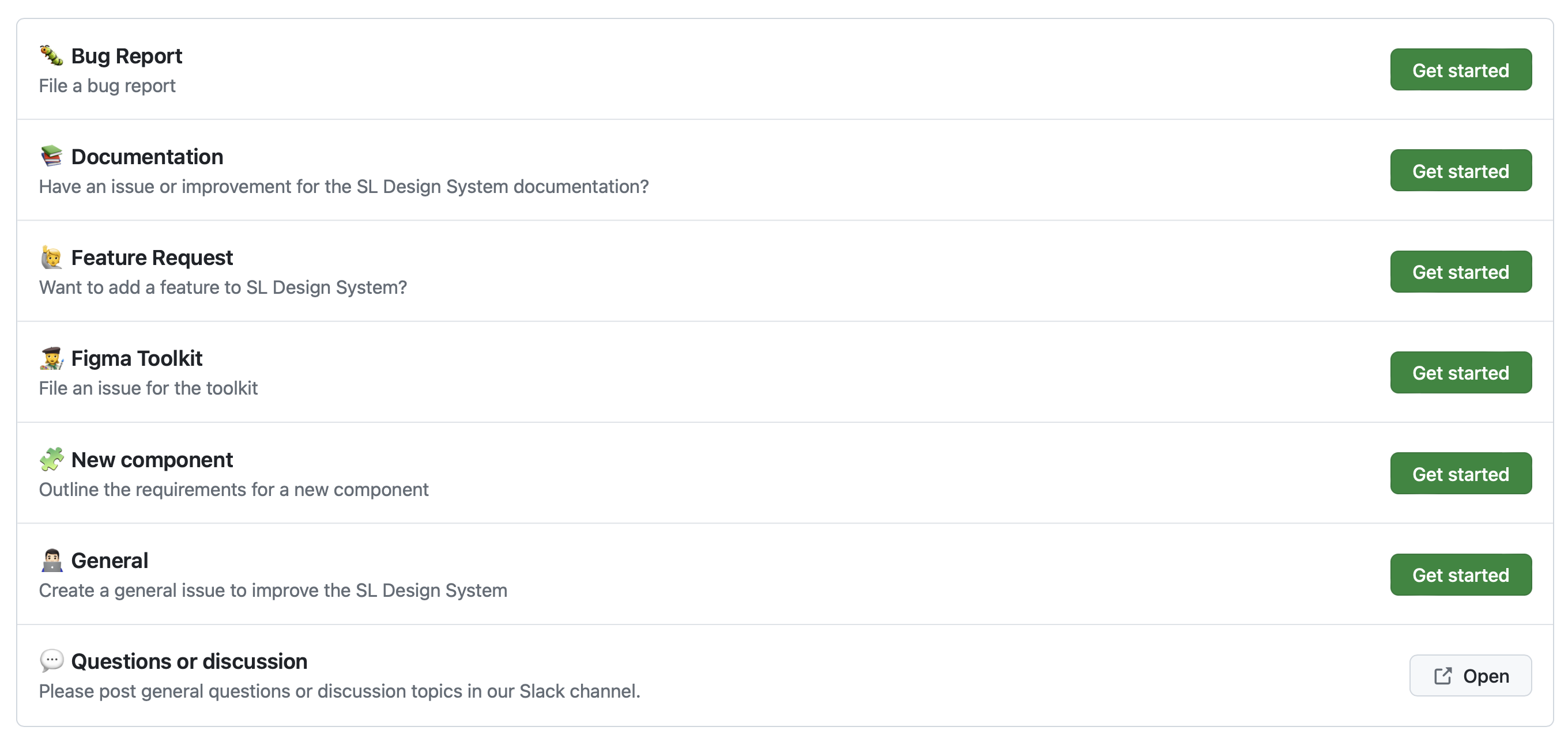
GitHub Issue Templates
We’ve updated our GitHub with new issue templates to streamline the process of reporting bugs, requesting features, and suggesting new components. You can find these templates at our GitHub issues page. This update allows you to create issues for:
- Bug Reports
- Documentation
- Figma Toolkit
- Feature Requests
- New Components
Previously, you could only report bugs, but now you can also request new components. We’ve created issue templates for the Figma toolkit and documentation, empowering you to submit and monitor directly through GitHub.
Please note, Figma comments will no longer be monitored due to tracking difficulties. For all matters, including those related to the Figma toolkit, kindly submit an issue on GitHub.
Important: Ensure you’re logged into your GitHub account to create issues.
Developer Resources
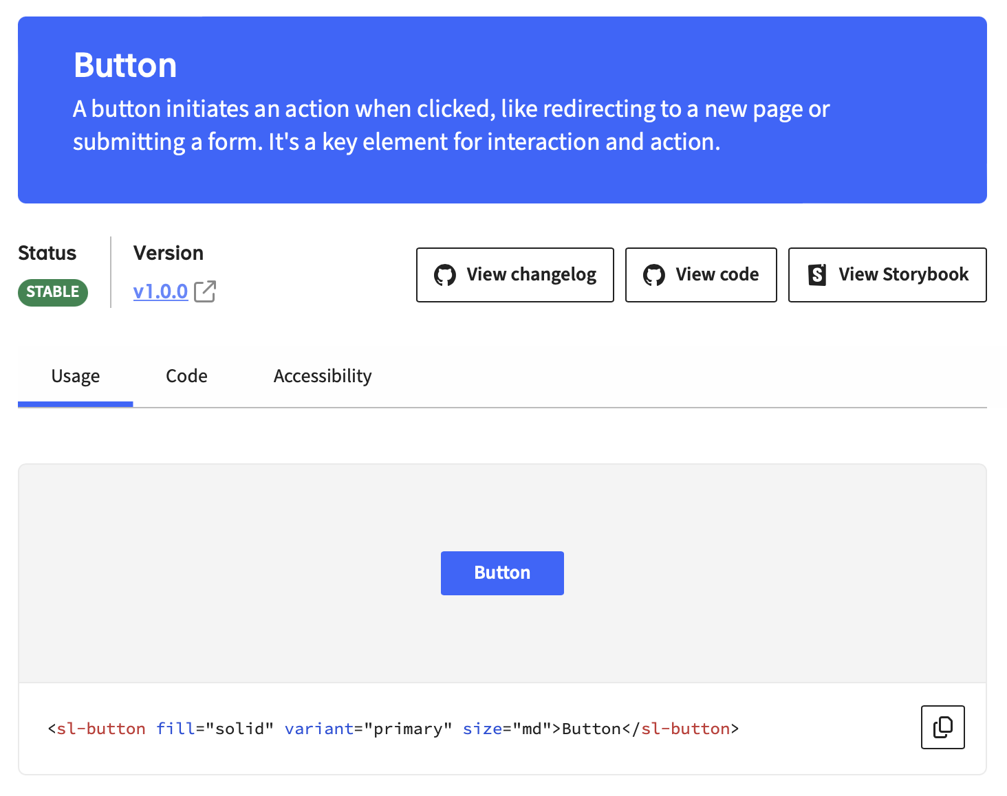
Developers can now find all necessary information about a component on its detail page on our documentation website, sanomalearning.design. This includes the component’s status, exact version, and links to the changelog, code, and storybook. The statuses indicate the maturity of the component:
- Draft: Active development, not ready for use.
- Preview: Ready for use, available in all themes, but not yet used by CFAs.
- Stable: Mature and used by CFAs.
- Deprecated: This will be removed in the future and should be avoided.
Form Enhancements for Better User Experience
Our forms have been significantly improved to support composite fields, allowing for a main control linked to the field’s label and help text, with secondary controls for more complex inputs. This update is particularly useful for fields like radio groups with an “other” option that triggers a text field.
We’ve also introduced:
- A new Lit
FormControllerreactive controller for managing form state - A new pristine/dirty and touched/untouched state
- A new
<sl-form-validation-errors>component for displaying validation errors - The ability to set the
valueof the form on the<sl-form>component - The ability to use nested & array names in the
nameattribute of form controls - Unregistering controls & fields when they are removed from the DOM
Naming Consistency and Styling Updates
- The
<sl-textarea>component has been renamed to<sl-text-area>for naming consistency. - The
<sl-inline-message>component has been updated with improved styling and now includes an action slot for buttons.
Introducing the ‘Info’ Button Variant
A new info button variant has been added, designed to fit into the action slot of the sl-inline-message component, providing users with additional actionable information.
Commitment to Accessibility and Browser Compatibility
In our ongoing commitment to accessibility, the checkbox component has been refactored to use a native checkbox input. We’ve also fixed the issue with Accordion icons in Safari when zooming, ensuring a consistent experience across different browsers.
The Checkbox documentation is now live!
08-11-2023
Dive into the details on when and how to effectively use checkboxes, and discover accessible implementation techniques. Explore the guide to ensure seamless integration and a good user experience.
We released a pilot version of our first component!
10-10-2023
The button component is released as your first taste of the SL Design System to come. You can check out the documentation page and even start implementing a button or two in a test project to see how everything works.