Card
Cards display content or actions related to a single subject. They should be easy to scan for relevant and actionable information.
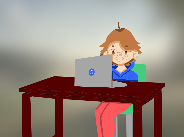
Fun adventures in digital learning
Digital learning is when we use computers, tablets, or even phones to learn new things. It's super cool because it lets us explore all sorts of topics without even leaving our homes!
<sl-card style="--sl-card-horizontal-breakpoint:500px;">
  <img slot="media" src="/assets/images/components/card/card-image.png" />
  <h2>Fun adventures in digital learning</h2>
  <span slot="header"><sl-badge variant="accent" color="blue">new</sl-badge> written by: Lynn</span>
  <p slot="body">
    Digital learning is when we use computers...
  </p>
  <sl-toggle-button slot="menu-button" aria-label="Favorite" shape="pill">
      <sl-icon name="far-heart" slot="default"></sl-icon>
      <sl-icon name="fas-heart" slot="pressed"></sl-icon>
    </sl-toggle-button>
</sl-card>
When to use
Content Grouping
Cards are great for putting similar content together. Use them when you want to show information about one specific thing.
Visual Hierarchy
Cards help organize information clearly. They make it easy for users to scan and identify important information.
Modularity
When you need a modular design that can be reused across different parts of your application, cards are a great choice.
When not to use
Complexity
Use cards for simple content presentation, but avoid them for complex layouts or intricate interactions.
Anatomy
| Item | Name | Description | Optional |
|---|---|---|---|
| 1 | Card Container | The placeholder of the card | no |
| 2 | Card image | The image of the card | yes |
| 3 | Card header | The title of the card | no |
| 4 | More button | To display secondary actions related to the content | yes |
| 5 | Card body | The content of the card | no |
| 6 | Card footer | Displays actions related to subject | yes |
Figma Options
With these options, you can tweak the appearance of the card in Figma. They are available in the Design Panel so you can compose the card to exactly fit the user experience need for the use case you are working on.
| Item | Options | Description |
|---|---|---|
| Orientation | horizontal vertical | Indicates the orientation of the card |
| Media margin | 1/2 1/2 none | Indicates if there is margin around the media or not |
| Ratio | Depends on the orientation | Indicates the ratio between the card body and media |
| Truncation | boolean | Indicates if the text of the card body is truncated |
| Media position | top left right none | Indicates the position of the media |
| Card icon | boolean | Indicates if there is an icon in front of the header |
| More button | boolean | Indicates if there is more button |
| Body text | value | To insert the text of the card |
Fun adventures in digital learning
Digital learning is when we use computers, tablets, or even phones to learn new things. It's super cool because it lets us explore all sorts of topics without even leaving our homes!
     <sl-card style="--sl-card-horizontal-breakpoint:500px;" fit-image>
      <img slot="media" src="/assets/images/components/card/card-image.png" />
      <h2>Fun adventures in digital learning</h2>
      <p slot="body">
        Digital learning is when we use computers...
      </p>
      <sl-button slot="actions"><sl-icon name="eye"></sl-icon> Read more</sl-button>
    </sl-card>
Options
CSS Variables
As many properties as possible are being set by CSS variables because that way you can easily make all the cards inside a container look the same by setting the properties on that container, or you can create custom css classes that consist of a combination of settings.
Subgrid
With the subgrid attribute you can make sure all cards in a grid have the same inner layout. If you want a grid of 2 horizontal cards, with header, content and an action button for example you can use the following css:
grid-template-columns: repeat(2, 200px 1fr);
grid-auto-rows: max-content 5lh max-content;
The 200px 1fr will make sure that each card has an image of 200px wide, and the rest of the card is filled stretched out so it fills the grid.
The repeat(2,... will make sure there are 2 columns of cards.
The values in grid-auto-rows will keep repeating themselves for as long as there is content.max-content 5lh max-content will mean both the header and the action buttons will be as large as they need to be, while the body text will have a height of 5 lines of the body text.
API
The card has a range of properties to define the experience in different use cases.
Properties
| Name | Attribute | Type | Default | Description |
|---|---|---|---|---|
fitImage | fit-image | boolean | undefined | When set the image won't be stretched and cropped to fill the whole container, but instead shown fully, with a margin around it. In horizontal mode this will need the card to have an explicit image size set, either by subgrid or by --sl-card-media-size | |
imageBackdrop | image-backdrop | boolean | undefined | When fit-image is set, setting this will create a blurred copy of the image in the margin around the image. | |
mediaMargin | media-margin | boolean | undefined | Adds a little margin around the image | |
orientation | orientation | 'horizontal' | 'vertical' | 'horizontal' | The position of the media in relation to the text |
subgrid | subgrid | boolean | undefined | When the grid inside the card is defined by a parent grid, ideal for layout consistency, even when the contents of the card change. |
Slots
| Name | Description |
|---|---|
default | Title of the card |
media | Image of the card. |
header | Subtitle or badges |
body | Body text of the card |
actions | Main actions of the card, these will be displayed at the bottom of the card, This can be a single button or a button-bar. |
menu-button | A menu button to display additional actions or a toggle button. This will be displayed in the header of the card. |
CSS Properties
| Name | Description |
|---|---|
--sl-card-media-size | Depending on the orientation, this will set the height or width of the media. Can be set in pixels, percentage or fr. |
--sl-card-horizontal-breakpoint | When card is smaller than this size it will switch from horizontal (when set) to vertical layout. |
--sl-card-image-backdrop | Color of the image backdrop when fit-image is set. |
Accessibility considerations
- Wrap your cards in a list to group your cards. Each list item
<li>represents a card. - If the cards are part of a specific group, add an appropriate heading or use
aria-labelto describe the group. - Update the heading level based on the content of the page to make sure card headings are in the correct, logical order. The heading will always look the same, so the heading level chosen will affect only the semantic meaning, so make sure that is logical in the context of the page.
- Each Card has a Heading level of the same level because they belong to a flat list hierarchy.
- Avoid having 2 links to the same URL (in the same Card) like one for the Title and another for the action (in that way we reduce the tab stops).
- Don't wrap the whole card in a link, a link can be placed in the default slot, making the whole card clickable.
- Avoid nesting interactive elements, such as placing a button inside a card that has also a link in the title.
Keyboard interaction
| Command | Description |
|---|---|
Tab | The first tab-stop in the card is a link in the title, after that it will move to the action slot, lastly the menu-button slot. Change focus on elements inside the card and subsequent actions. When the link |
WAI-ARIA
In the component itself we use multiple aria-attributes to assure the component works well with a range of assistive technologies. For some attributes however it is not possible for the Design System to add a meaningful value, because it relies on the context or way a component is used.
Attributes that we recommend you add in certain scenarios are mentioned below.
| Attribute | Value | Description |
|---|---|---|
alt | string | Image alt text, if the image is not decorative. Alt text needs to be different from the card title. |